Responsive Emails for Mobile Devices
With more and more emails being read on mobile devices, email marketers have gone to great lengths and spent many hours striving to create great responsive emails. Now, Office Accelerator Email Marketing enables even the novice to create outstanding responsive emails. Let’s answer a few questions and get you started.
What is a responsive email?
A responsive email is an email that automatically reformats on devices with small screens, with the purpose of making the email look better and be more readable on the small screen. That's it.
How do the emails reformat?
On mobile devices, columns in the email expand to the full screen width and drop below each other creating a single column, rather than displaying side-by-side like on the desktop. Sounds simple enough, right? (OK, the example below should clear things up for you.) Achieving this simple concept used to be very difficult and time consuming. Luckily, we make it easy. This means no programming and no html.
How about an example?
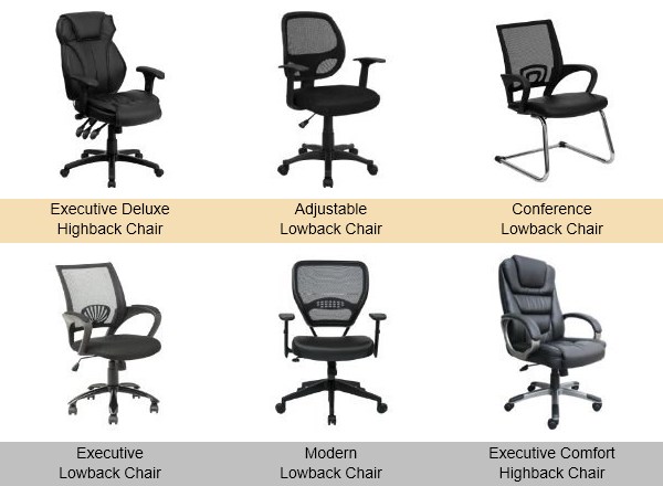
Let’s use a portion of an email as an example. This portion of the email consists of 2 rows of 3 columns, each column containing an image with a caption.
Whether it is a responsive email or not, on the desktop, the email appears like this:
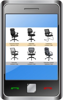
On mobile devices, without a responsive email design, it just scales down to the width of the device. It still looks professional, and looks something like this:
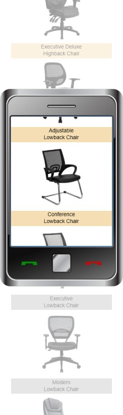
On mobile devices, with responsive email design, it reformats automatically to display blocks vertically. This easy-viewing email looks something like this:
For mobile devices, responsive emails are even easier to read and click on, yet still look great!
What can I do to make my responsive emails look this good?
Most of the work is already done for you.
To send responsive emails, you must check the ‘Enable Responsive Emails for Mobile Devices’ option in the email editor. Then follow these tips when possible:
Remember that columns within a row will stack vertically on a mobile device in a responsive email. The next row’s columns will appear below the previous row. Review the example above and notice that the second row of images appear after the first row, but each image caption stays with each image. That is because the image caption is in the same row and column as its corresponding image.
When possible, split wide images into 2 side by side images of equal size. Then use a 2 column row to place the images side by side. On a mobile device the 2 images will stack and appear larger rather than showing one smaller image.
Use the ‘View/Send Test’ feature to send your email to your phone and check it out!
That’s about it! Start creating responsive emails now!